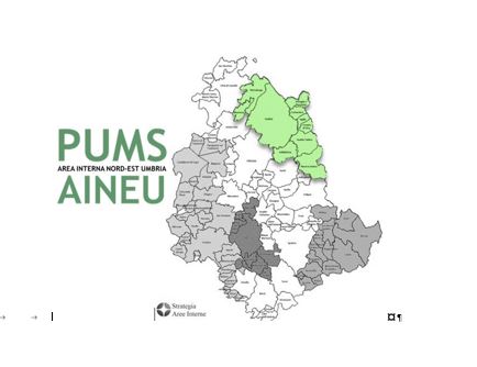
Starting from the historical dimension of the 10 Municipalities in the Area, the process of defining the Logo was initiated. Most of the 10 Municipalities in the Internal Area have a medieval layout, situated on hills or heights, and are equipped with characteristic and beautiful fortresses, towers, castles, bell towers, and churches.

Along with the historical dimension of the villages, the environmental and natural dimension of the Places, a distinctive feature of the Internal Area, was subsequently rendered in an ideogram.
The Logo can also be accompanied by icons representing the various dimensions of mobility as well as references to general Plan objectives such as Sustainability/Sharing, Active Mobility, Public Transport, Ecological Mobility, Cycle-Pedestrian Paths, etc.
The theme logos, colors, shapes (hexagon gear or ring), the green of nature, and common elements (hills and castles) are then combined to try to communicate the focus of the Plan: “starting from historical and identity roots and connecting the complex and multimodal system.”
Find out which combination was chosen for the AINEU SUMP Logo by clicking the download link next to it (document in Italian language)!


 Download PDF